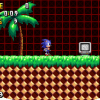
Jassbec Posted February 3, 2013 Report Share Posted February 3, 2013 Hello there! I'm making a fan-game,like... almost everyone in this forums And there is something that i don't like about the background for the first zone "Green Gate Zone" and i don't know,it looks kinda off. So here is a picture. http://jassbecspot.webs.com/apps/photos/photo?photoid=173986770 The background consists of 8 scrolling parallaxes,first 2 being the auto-scrolling clouds,other 2 being the grass behind the mountain and the mountain itself,the trees under the mountain,and the last 3 being the auto scrolling water. Hope you guys can give me some feedback on what can i improve,what can i do and that kind of stuff. Also i have the feeling that "Green Gate" has been used somewhere else so if you come up with a clever name feel free to tell me! Link to comment Share on other sites More sharing options...
Badz Posted February 3, 2013 Report Share Posted February 3, 2013 I'd say that the grass behind the mountains shouldn't be there. You might also want to give the trees and grass right in front of said mountain some more perspective effect; it looks a little as it they were painted on the mountain. I find the foreground to be a little off. I'd suggest making the Hill Top trees' trunks a bit shorter compared to their overall height. I don't like how the main ground Sonic is standing on seems to be made of small pillars stuck together; you should find some way to get rid of that effect. Still, this level looks really nice. There's a silly cut-off on the top-left of the big cloud on the right. Link to comment Share on other sites More sharing options...
Jassbec Posted February 3, 2013 Author Report Share Posted February 3, 2013 I'd say that the grass behind the mountains shouldn't be there. You might also want to give the trees and grass right in front of said mountain some more perspective effect; it looks a little as it they were painted on the mountain.I find the foreground to be a little off. I'd suggest making the Hill Top trees' trunks a bit shorter compared to their overall height. I don't like how the main ground Sonic is standing on seems to be made of small pillars stuck together; you should find some way to get rid of that effect. Still, this level looks really nice. There's a silly cut-off on the top-left of the big cloud on the right. 1-Yeah, i wasn't convinced with the grass behind the mountain. 2-Perspective you say? like...shadows? 3-Shorter trees? Yeah,i'm totally doing that. 4-Hmm,Actually i never noticed that. 5-Thanks! i'm doing what i can! Link to comment Share on other sites More sharing options...
Jassbec Posted February 3, 2013 Author Report Share Posted February 3, 2013 Oh and yeah,i'm fixing that cloud cut-off Anything else you guys can point out? Link to comment Share on other sites More sharing options...
OverbounD Posted February 4, 2013 Report Share Posted February 4, 2013 Your background is a cool concept. I think it could be even cooler if you layered that rock pattern on itself a few times much the same as here. Then you could put the resized hill top trees (great idea btw) in between the rock layers to give the effect that the trees are cascading down the hill. Link to comment Share on other sites More sharing options...
Jassbec Posted February 4, 2013 Author Report Share Posted February 4, 2013 Then you could put the resized hill top trees (great idea btw) in between the rock layers to give the effect that the trees are cascading down the hill. You mean like this? http://jassbecspot.webs.com/apps/photos/photo?photoid=173998633 Sorry for the crappy 3 minute Photoshop Link to comment Share on other sites More sharing options...
OverbounD Posted February 4, 2013 Report Share Posted February 4, 2013 Yeah. Except I couldn't make your trees bigger than the ones on the lowest level. Maybe that's what you meant about crappy photoshop. Also put a shadow under you grass. If you have your grass separated into it's own layer you can make a drop shadow for it by right clicking that layer and going to drop shadows set the size of the drop shadow to 0px and try the Hard Mix or Multiply blend mode. You can merge it back together and change the shadows colors if you wish. Link to comment Share on other sites More sharing options...
Jassbec Posted February 4, 2013 Author Report Share Posted February 4, 2013 i'm gonna keep that in mind. Thanks. Link to comment Share on other sites More sharing options...
Recommended Posts