Blue Frenzy Posted October 1, 2007 Report Share Posted October 1, 2007 I just remodelated my main site, after 3 years without touching it XD. http://bluefrenzy.cjb.net/ Do you like? anny suggestion is welcome. BTW: yes, i love dark colours Link to comment Share on other sites More sharing options...
Damizean Posted October 1, 2007 Report Share Posted October 1, 2007 Same as ever. Link to comment Share on other sites More sharing options...
Blue Frenzy Posted October 1, 2007 Author Report Share Posted October 1, 2007 Nah, before it was a menu on the left and a blue banner at the top. Link to comment Share on other sites More sharing options...
Slingerland Posted October 1, 2007 Report Share Posted October 1, 2007 Looks like it used to, maybe slightly uglier with the color choice. Link to comment Share on other sites More sharing options...
Blue Frenzy Posted October 1, 2007 Author Report Share Posted October 1, 2007 Any suggestion on colours? Link to comment Share on other sites More sharing options...
OverbounD Posted October 1, 2007 Report Share Posted October 1, 2007 I would drop the purple. Maybe a banner at the top of the page. You could also change the color of the scroll bar to match the page I tend to do that when working with iframes. Let me know if you need any help I know a thing or two about making websites. Link to comment Share on other sites More sharing options...
Blue Frenzy Posted October 1, 2007 Author Report Share Posted October 1, 2007 Sure. I don't know the tags to change the scrollbar colours. Link to comment Share on other sites More sharing options...
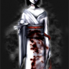
Amesuki Posted October 1, 2007 Report Share Posted October 1, 2007 I actully myself like it. It pretty cool, and I do like that image in the text. However it does need a banner. With a banner, and maybe a background image, it would look alot better. -=-Amesuki-=- Link to comment Share on other sites More sharing options...
Mark the Echidna Posted October 2, 2007 Report Share Posted October 2, 2007 Here's my criticism: You got the colors right, and that's a good thing. But there are some problems: - First, there's absolutely no indication of what page is it (no title, logo or anything). Don't make people guess by the URL. - Then, there's CJB.NET - It's crap and will flood you with advertisement. I say just use the real URL: http://fanmade.emulationzone.org/tewkewl/BFS/ - Speaking of which, don't you need to place banners on EmulationZone hosted sites? - Times New Roman can make almost anything look bad. Try changing it to a sans-serif font, like Segoe, Tahoma or Trebuchet MS... If you still want serif, try Georgia or even Garamound... - The default bevel-like shading of HTML tables is so 1997... Apply stylesheets to them. Link to comment Share on other sites More sharing options...
Blue Frenzy Posted October 2, 2007 Author Report Share Posted October 2, 2007 I am going to put a banner, but i have to create it first xD. Font will be replaced, ok. And, how could i center the things without having tables? Link to comment Share on other sites More sharing options...
Recommended Posts