

sonicyoda
-
Posts
417 -
Joined
-
Last visited
-
Days Won
3
Content Type
Profiles
Forums
Events
Posts posted by sonicyoda
-
-
Sooooo.... care to let us newbies in on what exactly this is?
-
It was my birthday on the 19th as well. Did I get a birthday thread? No. Do I care? No. I don't need random strangers on the internet to give my life some sort of validity. Besides, I was in fucking Tokyo with Svend from The Sonic Stadium.
Also, I like this community and following the projects that people develop. Full games hardly ever happened in the 'hey-day' of SFGHQ, so why is this an issue all of sudden?
You have to remember one glaringly obvious thing about this community; most games are being developed by ONE PERSON. That one person also has a life to live. They have to develop that game alone whilst they're in full time education or a job or whatever they fuck they do in the real world. If they ever release their game they get maybe a week of attention to their game and then it's forgotten only to be enjoyed by a select few enthusiasts. No wonder people hardly ever complete their games. It's a lot of hard work for hardly any praise.
Besides, if it bothers you so much why don't you man the fuck up and develop your own game and prove everyone wrong?
-
Got done with a rough of McSkip's basic combo. I don't know about the rapid jabs.
[qimg]http://i.imgur.com/QDIyg.gif[/qimg]
The rapid jabs look a bit... suggestive if you don't mind me saying. The motion blur effects need to stay on the same level as the long, horizontal punch for it to look right (I think!).
-
Very, VERY pretty. Not so sure about the sand though but it is becoming more and more apparent that sand is an absolute bastard to get right. Regardless, I like the blend of natural and construction. Seems to be a running theme with this game!
Also, apologies for getting touchy. I was only being silly with the newbie, I did not mean to cause any offence. This is the main reason the internet gets on my nerves from time-to-time; you can never tell HOW a person says something.
Also, cheers for the kind words Overbound; you're a ledge

-
ya we kno
totally unnecessary bro
Bloody hell, chill out! I was only having a laugh with the newbie. Sodding internet; everyone takes everything so bloody seriously!
Shall I stick a load of happy emoticons on the end so it's obvious I was being sarcastic?
 :) :)
:) :) -
I was baffled when I watched the interview with the character artist for ristar on the ultimate megadrive collection talk about his designs for a ristar sequel. would have been amazing.
You ever seen the bonkers original design for Ristar in the beta screens that surfaced a while back? He was called Feel instead and looked more like some spacky rabbit: http://sonicdatabase.com/Feel/Feel.htm
-
Sorry for the BUMP but...
i know it needs more colors and detail and i'll be adding them later.
I am looking forward to Sonic Before the Sequel 3D
-
Yeah, you've linked to an image on your personal desktop stupid.
-
Doesn't surprise me. This must be an awful lot of work for a bunch of bedroom coders.
-
Don't mean to de-rail the topic, but isn't there already a Fan Remix topic kicking about?
Here it is: http://sonicunited.org/hsfqmtif/forum/showthread.php?t=6715&highlight=sonic+fan+remix
-
-
http://www.youtube.com/watch?v=wUMizx22PaI
Careful, it's loud. But yeah, this shows about half of Dragon Valley Act 1. ^^ I recorded this before I started work on the spider badnik, so you won't get to see that just yet unfortunately.
This is incredibly impressive! Looks incredibly fun and the gimmcks and combat look really natural. Title card looks loads better as well. Can't fault it! Well done Strife!
-
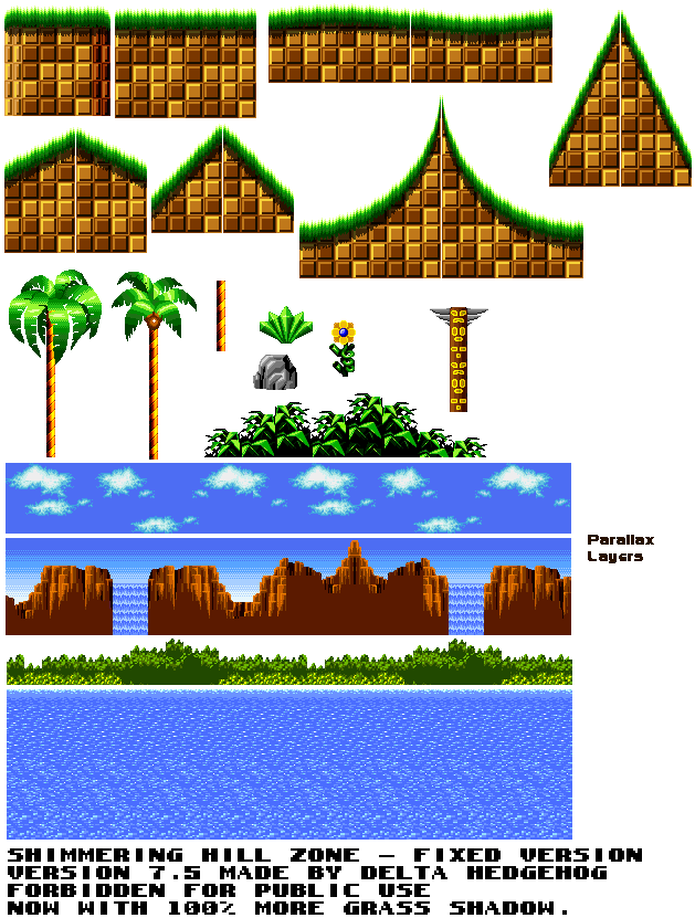
[qimg]http://img594.imageshack.us/img594/1413/sltest.png[/qimg]
Not sure I like the sheet of ice/crystal in the title card. This might be the lack of text or the fact it appears over the HUD. Maybe you should make the HUD appear after the title card as disappeared. I'd like to see it with text first though.
Also, I like the existing title card text, although I would recommend making it all one font. I think I prefer the styling on the Act I text better than the stage name text. Use that for both.
-
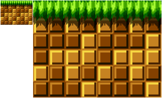
Something I noticed is you should have the grass extending inside of the loop and get smaller and curved.
Totally agreed on that front.
As for the grass I prefer this one: http://i836.photobucket.com/albums/zz281/darkspikes598/newgrassmoreoriginal.png
You really needed to stop putting in last minute edits. Get it all working first. I'm starting to see why you didn't get a demo into this year's SAGE.
Also, Delta:
It was one of hardest, most time cosuming things I've ever made...I'm lying. Wasn't that hard to do.
What was even the point of saying that? Just makes you look a bit of a tosser.
-
 1
1
-
-
You can try the old tech demo out here
Virus alert on my system.
-
-
Personally, I think the sprites fit the stage quite well. He's clearly stylised the graphics to make them look more "gamey" and not as realistic as they could be.
Also, I just wanna say that I'm massively impressed with this project so far. It looks stunning and I hope it plays just as well.
-
Thats what I've been trying to do. But anyway
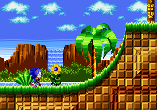
[qimg]http://i836.photobucket.com/albums/zz281/darkspikes598/mockupwithnobackground-1.png[/qimg]
Personally, I find this screenshot very pretty. The shading on the palm tree is significantly better and I couldn't suggest any further improvements. Stick with this tile set and finish the level and I'm sure it'll be great.
If I were developing this game, I would lay down stage concepts first (for example; grassy stage, snow stage, lava stage, city stage etc). Once that's done, map the stages on paper and think of some gimmicks you'd like to include like corkscrews, swings, push-switches etc that can be unique to each stage.
Once that's all done, start on some base graphics for the stages that you can use to re-create the maps you've hand-drawn. That way you can get the game working in a faster manner.
All in all, you should only worry about getting FUNCTIONAL sprites and tiles working at this stage in development. Once a stage is finished, then you can ask for critical advice on the artwork and adjust it as needed. It'll save you so much hassle than trying to finalise the artwork while you're still developing the stage.
Also, work on one stage at a time. It'll be too much work to deal with improvements to multiple tile-sets at any given moment. Finalise one tile-set at a time, finish the stage and then move onto the next. I just feel like you're making the development process far more complicated than it should be.
-
Another vote for green.
-
Pretty much any movie with spiders (due to the arachnophobia) but I suppose that doesn't really count.
Even though it's the only bit of the film I've seen, the puking, possessed child in The Exorcist doesn't sit right with me.
Also, the exploding Mr Creosote in Monty Python and the Meaning of Life used to really unsettle me. I actually find it pretty hilarious nowadays though.
I watched The Thing for the first time recently and that holds up really well for an old horror film. I think the bit that really made me flinch though was the part where their cut their fingers for a blood test. Strange really. The monsters were fucking creepy, but that bit just made my skin crawl for some reason.
-
I present to you guys. The new Sonic. He is supposed to have a backpack, kinda like in the cartoons and shit, but I haven't added it yet. Sonic is now taller, and features rounder shoes as well as new arms and different spines.
The sprites were fine! Seriously, why did you change them again!? All the time you've spent on the Sonic sprites could've been spent making stage graphics! This is getting ridiculously out of hand now!
-
Oh snap! This is looking gorgeous and loads different to the demo (I assume this is still CB, right?)! Very impressed Ironrind!
-
I've been working on a new 'Buzz-bomber' traveling sprite:
[qimg]http://i274.photobucket.com/albums/jj275/Ironrind/buzz.gif[/qimg]
Nice to see you back man! The sprite is wicked, love the animation. However, it's a bit big, isn't it?
-
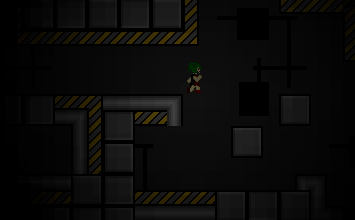
And I think I managed to make it a little more interesting at least. A simple filter really helps give it more of a mood.
[qimg]http://i567.photobucket.com/albums/ss120/FanGameRevolver/darknessftw.png[/qimg]
Too dark. The filter is a cool idea but definitely brighten it up a bit.
Also, try adding more non-interactive scenery to the background like pipes and gears.
What are you playing?
in Video Game Discussion
Posted
A load of old Saturn and Dreamcast stuff mainly. This includes:
Capcom Vs SNK
Sonic Adventure 1 & 2
Beyond Oasis 2
Street Fighter Alpha