Sonic Adventure was one of those titles that gamers loved to play. Not only was it our beloved hedgehog’s first foray into the wonderful world of 3D but it was also a mix-n-match of all the various types of platform elements that came before it. This variety was only one part of the magic that helped to make the game one of the best-selling titles for the ill-fated Dreamcast. To be fair, however, the game wasn’t exactly perfect in all areas.
With the increasingly common trend of remastering and remaking classic games, it was a pleasant surprise to hear that Sonic Adventure might be receiving this treatment as well. So much of Sonic Adventure can be praised but there are certain aspects to the game that can be improved upon. In this list, I’m going to go over what I feel like Sonic Adventure fan’s want fixed in a possible remake. Please be aware that none of these points are in particular order, as I feel they all would equally make the game better in my opinion.
1. Big the Cat
Big the Cat was one of those characters that people loved to hate on. Depending on which side of the conflict you were on, either loving the randomness or hating every minute of the fishing extravaganza, there was no denying that Big was a unique character indeed. The only real change aside from removing the character completely from the game would be to adjust his story. The concept of Froggy having a Chaos Emerald worked very well in the scheme of Dr. Eggman and Chaos attempting to acquire all of the gems in order to grow Chaos to perfection. However, the slow and repetitive fishing mechanic grew old extremely fast. It always felt to me that this mechanic was thrown onto the character as some sort of prototype for Sega’s other fishing games and never really fit into the Sonic gameplay style.
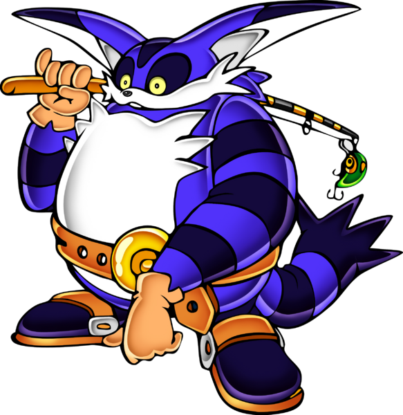
You can’t just remove Big from the story, as he was part of the game, but I do think a retelling of his particular section with some possible chase mechanics would make more sense. After all, Big could hop into any body of water Froggy was always swimming in and capture him that way realistically speaking. Give the cat some swimming levels (which he always moved so much more faster) instead of making the sole purpose of his objective to fish Froggy out of a body of water. Do something that explains why Froggy was being drawn towards Chaos, rather than just have him show up in a random tank of water on Eggman’s ship. Anything would have been better story-wise than what we got.
2. Camera Fixes
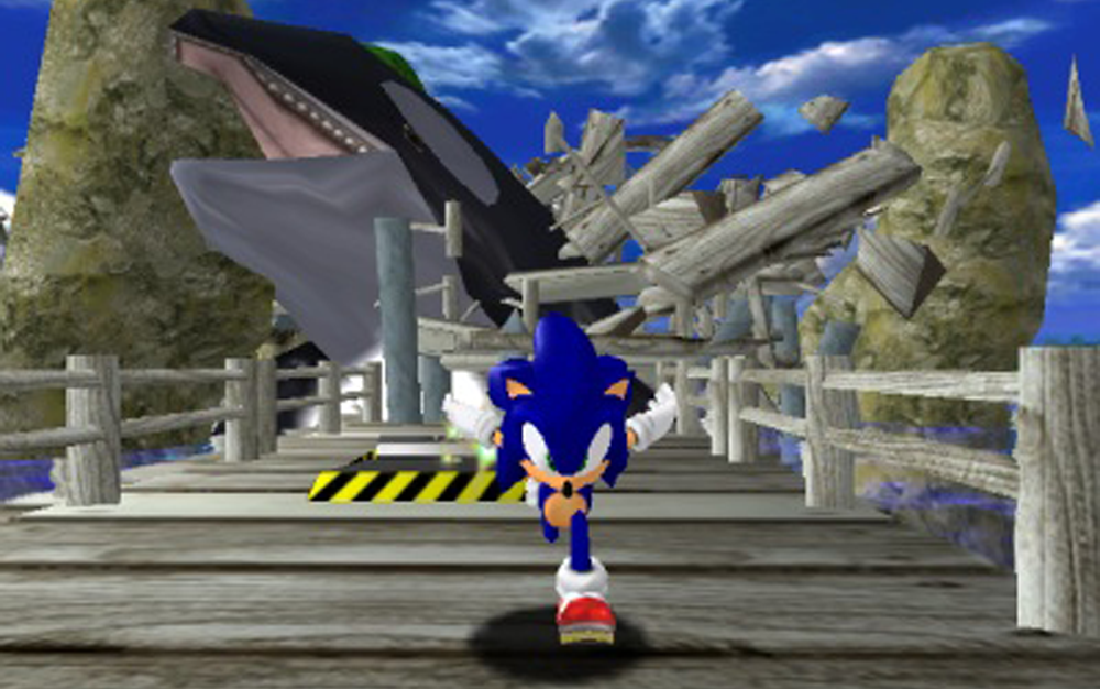
The camera in Sonic Adventure never gave me much of a hassle personally, except there were some strange tracking issues on transitional parts of the levels. However, many others have experienced hassles upon hassles with the camera rotating around frantically, locking in behind a character and not revealing the area they needed to traverse, or a combination of the two. Now don’t get me wrong, I loved the cinematic moments when the camera would swap to look at Sonic in scenes like being chased by a killer whale or running down the side of a sky scraper. In both of these examples, however, I know many times I would instinctively press the control stick in the opposite direction to try and do my own manual course correction but end up just losing momentum. These moments are high-paced and are part of the joy of having Sonic in a 3D space but they can come across as a conflict of input commands. The entire time a player has been pressing forward and running forward because of that input and now the camera is facing Sonic from a completely different angle, where forward would be backwards. (I got confused trying to write that sentence…)
When it came to the free roaming parts of the overworld, the camera could often get stuck behind a wall or object and clip through textures, making things a polygonal mess. A simple rotating camera in the overworld could have went a long way in fixing this, instead of it being on a fixed point to a character or a fixed point to a section of the overworld. Give players the ability to drink in all the details of those hub worlds and the attention to aesthetics thrown into each level!
3. Cutscenes
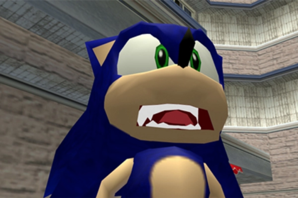
The cutscenes…oh man. What exactly can I not say about the cutscenes? The character actor models were always in this constant state of movement, even if they needed to be still. I can remember Sonic, Knuckles, or Eggman bouncing and swaying in this unnatural state. The animations were choppy, the lip flaps and facial features were the stuff of nightmare fuel (or memes depending on your crowd), and the gestures were often overused to the point that you didn’t have to wonder exactly what a character was going to be doing in any given scene. Anytime Sonic landed or began a sentence, he was either doing this open eagle-spread or putting his hands on his hips.
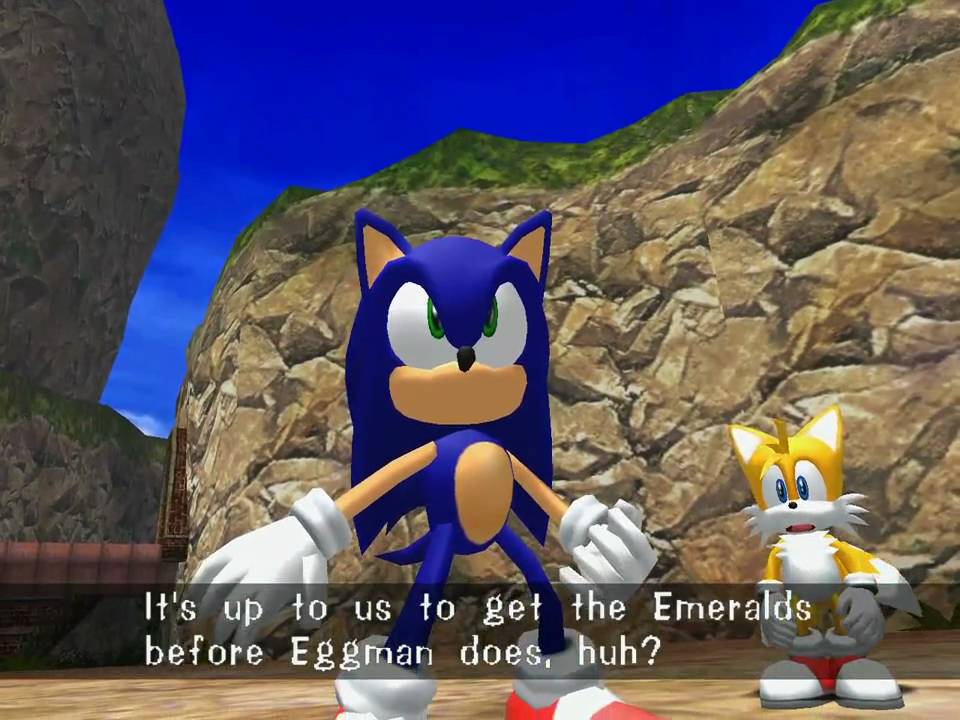
The dialogue often made things even more laughable, with lines being poorly delivered or performed way over the top. A healthy rewrite of the dialogue would give the animators so much more to work with. Couple that with some better tracking on the actor models and you’ve instantly got much more to work with. The animations for cut scenes in any recent Sonic game are a testament of just how good the studios can work the visual aspect of the storytelling. While Sonic Adventure had a connected storyline, the cutscenes could certainly be overhauled in order to make things much more epic, dramatic, and serve the game better. To be fair, the scene where Sonic turns into Super Sonic was just extremely well done. The chanting, “Open Your Heart” blasting in the background, the characters all looking at the radiant hedgehog as he zooms off to take on this foe. Good times man, good times.
4. Hub Worlds
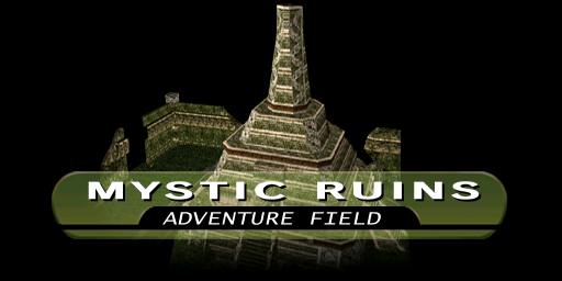
Station Square, Mystic Ruins, and the Egg Carrier were all amazing little Adventure Fields that served as hub worlds for the characters to all interact with and as a place to access levels. One of the problems with these hub worlds was the lack of any other elements in them. Sure, you had some bystanders in the city, exotic plants and changing biomes in the ruins, and even mechanical wizardry taking place on the Egg Carrier, but these open areas felt empty for the most part. Either through limitations of the hardware or just a general lack of any kind of emphasis needed to fill these giant areas, some sort of overhaul could be used. More NPCS, talkative tourists, more hidden Easter eggs and bonus sections to find, and even altering weather or terrain effects could remedy this aspect and help the Adventure Fields feel more alive. Instead of having extra missions simply be accessed through a menu, players could traverse these fields openly and meet with quest givers, so to speak, and explore different parts of the fields. While Mission Cards used this concept in Sonic Adventure DX, the resources they pulled from got stale very quickly. By adding onto the Adventure Fields and adding specific types of NPCs to receive the missions from, it would eliminate the need for Mission Cards all together.
Another element that could be expanded would be to travel to any part of the hub world without having to wait for a loading screen, such as having the Chao Garden instantly accessible instead of having to wait for the screen to transition. Interaction from scripted characters into these other sections of the hub world could help make the city feel more alive, instead of having some character just laying by the pool. The character could follow along at different parts of the story, mentioning events that had happened or their appearance change based on the day or night cycle. The cars, instead of going in an endless loop into the garage as a certain player-controlled hedgehog rode on top of their hoods (don’t lie, you did it too!) could interact by changing their traffic pattern to go around the character. Casino goers or tourists hoping to score some Mystic Ruin merch could talk about the blue blur as he raced into their field of vision.
5. Art Style
Sonic Adventure, while being the actual step into another visual dimension for the blue blur, was both a physical maturity as well as a spiritual maturity for the franchise as a whole. Not only had Sonic went from having a way past cool attitude, but now, he was older and reflected both extreme confidence and teenage indifference all at the same time. The characters were more mature and angular, instead of being more lovable and rounder. In growing older and surviving the events of each game prior, the characters seemed to grow up in order to meet a more mature audience that had already spent a previous console generation proving that it could do what Nintendo couldn’t. Even the infamous Dr. Robotnik, or Eggman as he had been known in Japan, changed his outfit and became much more slim and sinister.
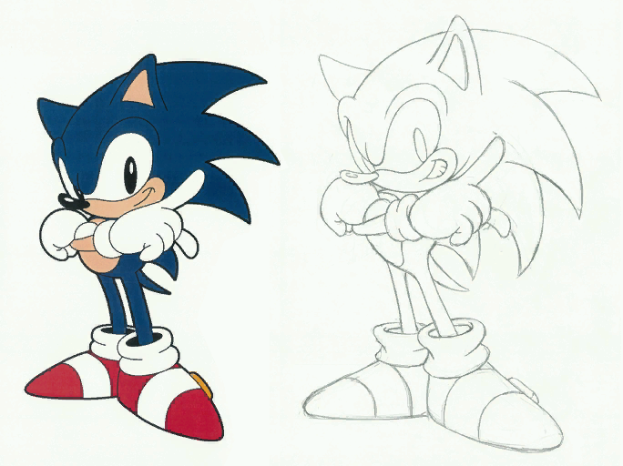
The art style was something that many fans adored and instantly clung on to. Sonic had not been captured in such a radical style and the Adventure-style art and assets were something that just held their appeal and charm. Even though numerous Sonic titles afterwards have tried to improve on this style, there is just something about the attitude and in-your-face aesthetic that keeps a balance between nostalgia and general adoration. In returning to this art style, Sega could capture the spirit of the Adventure-era games while seeking to deliver the ultimate expression of what their collective vision would have been had they had the technical prowess to deliver it at the time.
So there you have it, these are just some of the things that I believe the Sonic Adventure remake should have in order to improve on the original title. Do you agree with this list or have a point you would like to make? Sound off on social media and let us keep the conversation going!




1 Comment so far
Jump into a conversationSee i told you that sonic adventure needs some remaking.