

P3DR0
-
Posts
613 -
Joined
-
Last visited
-
Days Won
12
Content Type
Profiles
Forums
Events
Posts posted by P3DR0
-
-
Welp, for what is worth, these redesigns got the whole internet talking about this game for the last few days. There is no such thing as bad publicity, right?
-
 1
1
-
-
Well, at least Sega hasn't pulled a full DmC on the sonic franchise. A more than competent developer is developing it and they said from the start that it isn't replacing the original franchise(At least not yet) so that's good enough for me now.
IMO Design wise, Tails and Amy look the best with Sonic and Knuckles being the weakest, the tv show looks like it will be hit for it's intended audience and gameplay wise, I'll wait a bit as there wasn't enough footage to base my impression on.
Oh and Wub Wub trailer music...ffs
Actually this is Sonic's DmC. A franchise that was once made by japanese developers given to western game developers in the hopes of spicing things up a little and change a few things to appeal more to the west. Everything on this screams western culture. We have the brave hero, the bulk friend and the femme fatale. Exception being only Tails, I suppose. Who haven't changed much.
Knuckles is already a tough character, so making him buff isn't really that big of an issue with me. Also, keep in mind that Sonic Boom is not part of the main series, so the character designs probably won't be this way permanently.
Sonic CD =
BeforeAfter the SequelI don't think the problem isn't with making Knuckles buff but actually how badly buffed they did him. In Sonic Adventure we had 'buffed' Echidnas and they didn't looked this odd.
This about sums it up for me. The most appealing aspect of this game is the fact it isn't being made by Sonic Team. Could care less about the drastic design changes. I'm starting to feel like removing nostalgia from Sonic is the only way it can move forward anymore.
Knuckles, Amy and even Tails have become so rooted in uselessness in the last 2 generations, this was just about the only way of making them playable without the writing demanding them to be aggravatingly worthless. I'll take Ragin' roid Knuckles and bad girl Amy over homing missile announcements anyday.
I second that.
-
Welp, Sonic and Knuckles are the only bad ones in the redesigns. Sonic looks bad because of the amount of bandages and the blue arms. Problem with the blue arms is that it makes his colorscheme seems unbalanced, there is just too much blue.. Just look at Jassbec's edit and see how much that improved. But I guess it's just a matter of getting used to (after all Knux is pure red, from head to toes and no one feels like it's a bad design). I personaly don't mind that he is taller, I think it adds up to the agile personality. While is cute seeing a chubby blue hedgehog run it's a welcoming change.
Problem with Knuckles isn't because he is bulk. No, not at all that is an amazingly good idea. After all he is supposed to be strong as hell. Problem is that he should be square-ish and more angular than round and full of curves. He looks like Mr. Incredible (not the younger one) where, yes, he is strong, but he is also floppy. Strong characters should never be round, otherwise they look fat. Look at Super Heroes and how angular and square-ish they tend to be. Also again with the bandages.
Amy's redesign is Ok. it could've used some more white in her dress to separate red from pink. But that's the only real complain I have about her.
Tails is just what I've always wanted for him. He looks cool, looks smart and have a toolbag. What's not to like? Even the bandages look cool on his shoes.
The overall game and TV shows seems like a fun new experiment for me. It's a chance for Sonic doing something entirely new. Explore new posibilities and have a new type of gameplay without having to stay too close from the "gameplay rules" the series set in almost 20 years ago. Mario changes every game, some have 3 types of jump, others have wall jumping, others have a water gun and others are set in mini-planets. Change is what keeps a series fresh and since this isn't cannon there is no reason to bitch and being negative. Let's try to be positive and welcome this well deserved change to this series we love so much instead of complaning once again it's not the same Sonic we grew up with. Things change, either go with the flow or get the fuck out of the river.
-
5
-
-

I like drawing chicks.
-
1
-
-
While you and Alex are right, just wait a couple a days to see if he gets anything up. Then you should.. say things(?) (imo).
Sure. But the same logic applies in reverse, he should've waited a couple of days 'til he had something more substantial to show. Then he should... create a thread. Not the other way around.
Not imo, but as a basic rule of SFGHQ (that I have no idea to why the fuck it isn't pinned):
http://sonicunited.org/forums/index.php?/topic/3229-some-general-rules/
-
1
-
-
So I guess they've thrown the "proof of concept" rule out of the window, huh? Unless, you know, a HUD, a screenshot of a splash screen serves as proof (which in my book doesn't).
-
Here's a pre-preview. Gonna be showing a video soon, but I thought I'd show everyone the only remaining technical issue I'm currently having.
If I could figure out how to attach meshes together in 3DS Max without screwing up the skinning, this would not be an issue. In Blender it's as simple as Ctrl+J. But I can't use Blender for the import process due to file format issues.
I've asked on the Autodesk forums, so hopefully someone can help.
Your problem seems to be on the texture and not the mesh (if you're talking about the white line in Sonic's head). At least in 3DSMax you have to give some space so the edge of the UVs never actually touch the edges of the texture (just give something like 1px or half a pixel and it should do the trick just fine). Or you should try to add some blur to the edges like so:
So even if the line does appear, you will have the line in the same color as the overall texture instead of having a white one making it impossible to note the difference. But be sure you're happy with your final texture because bluring the edges make it a bit difficult to edit later on (as you can probably see in the pic I posted).
-
It's a good show. My problem with it though is that they're trying to tell an enourmous story throughout just a few episodes. I mean, beats making films out of it of course, but the story tends to get hushed and in some ocasions the story tends to be a bit different here and there Like the Red Wedding which is WAY worst in the book. It's not as bad as Walking Dead though and most of the time the story is consistent with the books. Just wish there were more episodes so you can empathize better with the huge roast of characters. One of the things I do like over the books is that all the characters are a bit older in the TV Show, I mean it's easier to believe on a 17 years old Joffrey than a 12 years old one or a 19 years old Jon Snow instead of a 14 years old one.
Other than that, good show. Great production and actors. The music is pretty great also.
-
1
-
-
Thanks dude, we're going for a high res style. Originally we were thinking pixel art but we've upgraded up to doing it all hand drawn with a mix of 3D assets as well (though the 3D part isn't 100% yet, but both I and the programmer are able to make 3D stuff so it could save time). The way I see it is high res sprites would take me just about as long, if not longer, than just foregoing pixel art entirely. The interface also isn't 100% final in terms of its design but it'll definitely be something along those lines
 .
.That's great to hear. Especially with the interaction of 3D, that can make for some really cool level of detail. Perhaps not to model every single asset, but just to give a few of them some extra depht like backgrounds, bricks and stuff like that.
I also heard that Unity (if I recall that's what your friend is learning), works with 2D games now so you can totally create a 2D game and have some 3D here and there as you intend.
The HUD reminds me of Golden Axe III. You should make the face icon "Doom-style" - have it react when hurt, or underwater, among other things.
Loving what you have here, stylish as always. <3
That'd be pretty cool. Haha, I guess not as much in the lines of Doom, of course, but perhaps small changes in her icon as she attacks, interacts, take damage and stuff like that. Just some subtle changes, I guess.
-
1
-
-
>ctrl+F
>"box2D">0 results
Son, I'm disappointed.
-
Oh baby, that is b00teful. I love the interface.
What are you planning for the graphics, btw? Pixel art? Hand painted drawings like Rayman Legends/Origins?
Because I must say, altough I love pixel art, seeing just how much detail you could get into that simple sketch, seems a waste to not invest in some high quality assets with digital painting.
-
1
-
-
I'm really digging where this is going. Altough I've never been such a fan of the Moegaman Zero/ZX/ZXA art style some of these concepts are really original and I can't wait to see some of these cool ideas in motion.
Just wish there were more "tech" in those characters. I mean, Proxy looks like a girl wering Rouge's clothes after doing a ton of leg and byceps excercises in the gym. Would be cool if there were some actual thing related to "proxies" in her design. Motherboard could get some of those "slots" (where you put RAM, graphicboards and whatever) in her armor perhaps even a processor in her "heart" or a cooler.
I dunno, just thinking out loud, don't mind me. Keep it up, looks great.
-
can i has be writer 2, i wrote very god.I believe that as for the main site, every news (all things Sonic or general gaming related) is good news. A good modder in the community started a new project and has something to show? That's great, let's show him our support. That's the sort of things that keep people motivated to work on their projects. A new fangame appeared and looks rather original or sweet? Amazing, let's write an article. Someone put a Shrek model in Sonic Generations? Let's give him all the swags, our buttholes, our wives, daughters and sisters and praise him like a new Jesus.
-
Is there any way to edit those variables in the engine without it being a massive hassle to work with?
Yes.
I believe all the Sonic physics related stuff is contained inside that Sonic Actor (not the player) in the Test Level that comes with default with GDK including options like make the boost magnetic and whatever, Just put that mesh in your stage and mess around with it.
And don't worry, I don't like much of the physics in GDK also. Sonic stays in the air for too little, fell like a rock when falling, etc.
The camera stuff I fear I can't help you with that. You could look around the internet and I'm sure someone have succeded in doing it or so. But I fear you won't be able to get like a Generations camera (one that follows Sonic from behind everytime) without coding. But don't second me on that one. Best idea is to ask Xak on the forums (I believe he is more frequent on Retro's).
But most of the stuff you want to do can be done with Kismet or that Sonic Actor in the test level.
Good luck, man.
-
That running annimation of Mighty is adorable. Altough I don't really like how flat the feet look when they reach his butt.
But still, adorable. I'd love to see a Sonic running animation also based on SegaSonic.
-
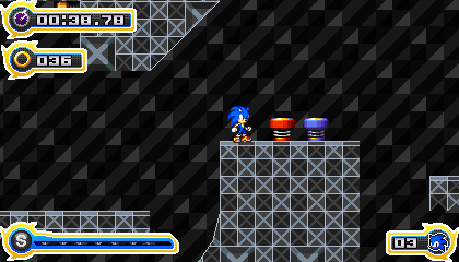
This could have been better...
Cool screen and all but god the HUD is large.
Here is a tip: at least when it comes to Sonic HUD's: less is more.
The top left corner of the screen is pretty much blocked. If there was a badnik in there the player would probably get shot.
Look at the classic HUDs, yes they were sort of large with all that text. But they were also spaced well enough and had thin letters which wouldn't inconvenience the player all that much.
Not saying the HUD is bad just excessively large for too little information. The yellow border can go and so can the "spikes" I mean they're cute in the boost bar (I'm assuming that what it is) like Colors had but having in all other elements is just unecessary.
Look how much screen space you were wasting on that yellow and white outlines and how much more clean stuff looks now. I even kept the spikes in the boost bar just with some small edits to make it more consistent:
-
You've answered your own question, OB.
That's more or less what I'd like to see.
-
That Level design and actually the level itself kick so much ass man!, but with that much color the people will actually see the different paths? maybe is because its an image not an actual gameplay but that's my opinion.
Hey here is a mock up of how will look Flame Rift from The Mystical realm from SRB2 in Sonic Recreations, its missing the parallax because im still working on it, but it will have lava in mode 7 to look more 3D-ish, im working more in this tilesets because im planing on release a demo with Flame Rift and Cross Station classic, this is the modern version of Flame Rift

Welp, it looks cool and all, but the lava doesn't really fit in. It needs some better color scheme and less contrast with the sky. Remember that lava tends to release smoke into the athmosphere and gives off light as well. So it's pratically impossible that a region filled with lava would have such clear skies. For me, especially after Lost World, it looks like orange juice.
-
That Zeena looks great, Shimbs. I'd love to see the rest of the Deadly Six in your artstyle.
-
Oh baby, it's here.
-
1
-
-
I know it's not Sonic, but we should play Worms Armageddon sometime. Endless fun, and from what I've heard, the steam version connects to non-steam versions.
THIS!
Sonic United vs SFGHQ
-
That suck balls, Azukara.
I'm extremely jelly, those look amazing and amazingly stylish. Loved the pink/purple hair chick
-
I would like to see the box2D physics applied to Sonic Worlds in a way much like that Sonic '06 fangame did where Sonic would interact with the objects but wouldn't "collide" with them. Just for eye-candy really, where instead of having cheap ways to make destructible objects, we could have more "realist" ways. Not sure if can be done, though.
-
Nice. Way to bump a 5 years old thread.
Welp, now the damage is done I might as well...

Post your screenshots thread
in Game Project Showcase
Posted
Yo, Candescence, that Digimon stuff of yours looks pretty tight even though I don't really cared much for Digimon, seeing it in action really made me want to test it out. I liked the "water" effect you get from the dark rooms, but I feel that this game have the same problem that Castlevania one of yours has... Lack of graphical consistency. I'm okay with pixel-art games using gradients and new tech from this day and age, but when there are too many different things the game loses it's identity. For example you have non-pixelated speech bubbles, with non-pixelated text and the "speech options" you have are in pixelated text. You have enemies from other games that are very different from the art-style of the digimon characters, You have a great looking "arena" (the grass one) with one style and a castle (or whatever that is) in a very different artstyle. In the first arena you have pixelated water in the castle one you have vector water, etc.
I'm cool with spicing up things a bit, but your stuff while it looks ok, feels like there is no identity. Try to sprite some stuff by yourself or at least adequate some stuff like enemies to the digimon's style. If you can't try looking up for help.
These are my only problems with it, but still looks pretty interesting and I'm looking foward to give it a spin.