Leaderboard


Popular Content
Showing content with the highest reputation on 01/07/2014 in all areas
-
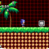
Well I was a bit bigger in developing games around 1 - 2 years ago but hey I still have some of the magic. I kinda been missing out on this community lately and I was an early member on this site and I mean early member as in I was here when it was made but anyways I have done various game designing as well as Art and Music development. I see A LOT of posts about people 'trying' to start the next hit Video-Game but they have nothing to show. I'm willing to help those who ALREADY have something drawn out and sorta developed. What I mean is if you don't have ANY concepts drawn out, no screen caps of current project or not even a dedicated engine then there really isn't much I can do since you have no information that you can supply me with and with no information how can I help But if you do have something already drawn out I might be able to help. I'm NOT going to completely design and develop your game! I will help with some tasks - given that they aren't impossible and extremely time consuming - I will also give pointers and such and help lead you to a successful project so you won't make the same mistake that I have made in my past lost game projects :/ Reason why I'm wanting to do this is to give back to the community that I miss and it would be sick to see something become big or become a successful game that the community built. Also this is all out of the kindness of my heart so please DO NOT pay me hahaha I don't want your money ahahha Now I don't want to come off as some AMAZING, TOP 10 game developer because I am not that hahaha I am just a dude who enjoyed developing games as a hobby and did some minor projects in my past. Here is the list of programs I have experience in: Unity 3D - used to develop my 3D games at which I am best at (I suck at UDK!) Blender AutoDesk 3Ds Max FragMotion RPG Maker (back when I was just a young little game developer around 5+ years ago maybe 8 I don't really know it was a long time ago hahah) Photoshop Corel Painter X3 Sony Vegas Pro (been using this for YEARS) Fl Studio (I am a music artist as well ) Cool Edit Pro (music engineering / producing / editing) and various other programs I know not all of these are 'game engines' but they all have some important aspect to game development and it's to give some background of various programs that I used so you have an idea of my background and to see if I am of use. Now for a some images of my works here are some pictures - Project Blue - my sonic game Random 3D Renders of a Home that I was trying to make some game Music stuff Check my soundcloud - but of course not ALL of my music is there I am very open and can design / engineer 'almost' any style of music...just takes time SoundCloud - Need something I didn't post? Just post a reply and I will see if I can do it or match it. Need some pieces of art that I have done? I can post some too! Haha overall I'm not AMAZING but I think I might be able to help some people -Edit- Coding languages that I have some experience in but am a little rusty is - C# C++ Java Visual Basic and been a security annalist for webpages and such so I have a background in Python and others3 points
-
This could have been better...1 point
-
@ECLIPSc70: I think you may want to lower the contrast on the white and black pattern since it draws attention away from the logo and more toward the pattern. Red and black may work better in your favor since it demands less of your attention since it's colors are closer to the logo's. The logo should still stand out though since its realitively simple compared to the busy pattern in the background. Looks good though, I like what you have going on. I had a livestream earlier today, some of you where in it (thanks for showing up btw you're all awesome <3) and I got a lot of work done on the level. So thoughts on the 2D section's level design? It works fine the way it is I think. The main issues I'm having with it right now are mostly just super bugs with the splines (which are quite hilarious btw) I'll make it pretty later. I have less than 14 days to finish this level before school starts back up again. Thoughts? EDIT: I've also found the major offender of the performance issues I've been having lately, and unfortunately, its the reflections in the puddles. The second I took them out the framerate sky rocketed. Performance was an issue even on low settings, so the reflections are just going to have to go :C I'll be trying to come up with a psuedo reflection puddle thing though to try to keep what life they originally brought into the level.1 point
-
Unity Pro. I hate Unreal Engine. Problem with using these engines is that you can tell when a game is made on it. However I added various unique scripts to attempt to make mine not look so much like a Unity Game. Unity isn't THAT popular but I prefer it over UDK since it was easier to pick up on.1 point
-
A.T.: Wow that looks pretty awesome. I know just by looking at it thats not unreal. So indeed, whats it built on? Chaos-fusion: I was gonna go into a huge tiraid about it as well but gsoft beat me to it xD I'd say the first one tho the one gsoft posted is far better and you should prolly go in that direction1 point
-
Chaos-Fusion: Menu windows look okay. The first layout is better because it has the money and time in a separate area - it makes no sense to put it along in the character info section, unless each one has his/her own wallet. As for the character information itself, it needs more spacing, and the status effects might benefit from using icons instead of letters. I suppose that's not final, though. One thing looks odd: every window item has a bottom edge, except for the character icon ones. Is this intentional? I suppose it could be if these animate when opening the menu or something. -------- Here's a little example of how the character information can be set up in individual windows instead of just one (the darkened one at the right is for the inactive members). I based this on a bit on your example and some of Tales of Eternia's menu. You should check out different RPGs for ideas and layouts. For example, Breath of Fire 3 and 4, Tales series. FF works too. Just don't use WRPG menus as reference... they're usually cluttered and aren't easy to use. Instead of the white circles, picture icons that represent each stat. Instead of the yellow square, picture a status effect icon. And lastly, picture the sprites instead of the triangles. I think you can put in the alignment and element in the sprite window instead of the info window. Also... "Mild Headache"? What's that supposed to do? Heh, making this reminds me of my old RPFG project. But it's no longer a Sonic fangame... and I need to get back working on it. ------------------------ AT: Looks neat, the first screen reminds me of Planet Wisp Act 1. What is this built on?1 point
-
Been ages since I been on this site but might as well share my long lost game that I was working on for months and kinda just...well dropped here are some screens of it - Title: Testing Structures and High Res Textures as well as animated grass: Jumping mid air Ugly Pause Screen GUI - in mid running Standing on a hill...1 point
-
No! I refuse to succumb to the barrels! I will fight the battle, even if I'm the last one left!1 point
-
Shocking news, barrel discovered in Shadow the Hedgehog. Stay tuned for more barrel news.1 point
-
Crappy google hangout sketches from last night. Started to kinda burn out on the 2nd page of doodles. I don't really do fanart or really like doing it all that often so this is kinda rare haha. Coloured in the Midna one just 'cause she is my fave Nintendo character.1 point
-
just finished the pixelart version of the new SFGHQ logo Overbound made. Redoing the whole shading was quite finicky, especially on the small "fangames" letters, but it turned out not too bad I think1 point
-
The sad part is I'm willing to watch the entire video.1 point